Tuesday 12 March 2013

Alexander Rodchenko


Alexander Rodchenko

Inspirational images by Rodchenko:


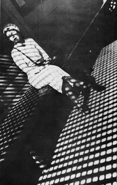
Rodchenko diverged over many parts of constructivist art, even fashion illustration, designing the costume for plays in 1914 in a constructivist manor. Rodchenko was known for his unusual image angles, taking images from different perspectives, common in the constructivist movement; using abstract shapes to create something new.

He took a lot of images taking advantage of the new scale of buildings, many from above or below; celebrating new structures. He had a much straighter style approach to photography, using a large depth of field (showcasing what a camera can do) and rejoicing new communication and technology. He was so at one with constructivism at the time critics began to complain that he didn’t care about the actual content of his photographs. Rodchenko is well known for using a Leica, as shown in his picture “Girl with Leica”, 1934. I really admire his full use of tonal range, although the shadows are not quite black.
I chose to incorporate a range of images/ideas of Rodchenko’s into my work. I tried not to focus on the content of the image too much but wanted to focus on the actual structure and composition of the picture without making it look too modern. I really admire the pieces of work shown, using squares in frames/lighting to actually make the composition of the image. Whilst looking for places to take my images I came across this lamppost that looked quite vintage and instantly reminded me of the content in some of Alexander’s images as shown. I tried to gain a full tonal range whilst taking my images, using a slightly longer exposure and a small aperture (on the lowest iso of 100).

My final image (inspired by Rodchenko and constructivism):


I composed my picture by trying to make the lamppost slanted and the lines from the net coming in from the side, creating lines and structures. The main reason I chose to photograph this area, other than the constructivist inspiration, was the combination of modern and old coming together. To me, the lamppost looks more vintage inspired and with the grouping of the football net it adds an element of something more modern, towering over the surroundings. For this reason I also decided to keep the security camera in the background, celebrating technology today as Rodchenko did in his images. I tried to give the same texture to the sky as prominent in Alexander’s work, full tonal range but at the same time not too overpowering. 

Martin Parr


Martin Parr

Parr’s series “common sense” makes a statement about the modern world, social and cultural tourism. It illustrates the middle/working class’ behaviour and the ways of life. There are a range of images, from backs of heads to typical English food. The images of food tend to illuminate and bring out the bad features in the food such as grease and sugar, illustrating the working class life style.

Some of Martin Parrs most influential images:


The images have been shot with ring flash, usually in daylight. This makes the colours more saturated and shows that Parr described as: “what I liked and disliked about middle classes”. A lot of the main themes seem to be money, appearance and consumerism. English clichés are used throughout such as tea, the union jack and novelty items. This has been very popular in France. It shows England the way people from abroad may picture it.

In my images I have chosen to travel to Brighton which in the summer is the height of British tourism. Parr took many of his images in Brighton and as I have friends there I will be able to arrange the trip. I am a regular traveller to Brighton and even past the seasonal months there is always a very British feel.
I wanted to keep the themes of English tourism by photographing something that could in a way define or explain this. Whilst exploring Brighton I photographed a few sights/objects that stood out to me. I went in a sweet shop and found an English breakfast made out of rock which, I felt, perfectly reflected the theme of consumerism and showed off middle class faults. I took the image at a slight angle that appears to be prominent in Parr’s compositions, rather than from a perfectly straight above viewpoint.

My take on Martin Parr's method:


Edward Weston


Edward Weston
I am a massive admirer of Weston’s Landscape images. During the 1930’s Weston and others formed the f64 group, f64 is one of the smallest apertures on the large format camera they were using larger formats, mainly the 8x10. The f64 group wanted to take advantage of photography as a medium, their photos with sharp detail, largest depth of field and full tonal ranges. Although I have noticed in much of Weston’s work his blacks are slightly greyer. They did believe in any photo manipulation (not even cropping in the darkroom) but relied on their exquisite hand printing.

In May 1928 Weston is claimed to have made his first focused attempt to take photos of a landscape. He is now one of the most famous modernist photographers to take images of the America, attempting to explain the American landscape through his images.

Some of Weston's most influential work:


The images I have chosen to concentrate on are of the dunes in Oceano during 1936. These images focus on the details and the curves of the landscape rather than the landscape as a whole. I also admire the sky shown in some of these images, it shows the fine clouds. Conceptually, as these are known for trying to define the American Landscape I would like to apply the same concepts in my images but with my local landscape. I live in quite a hilly area and whenever I visit Burton Dassett near my home the sky tends to create patterns that I feel could reflect England’s weather; sometimes sunny but always with dark skies and rainfall (a mixture of all).

Aesthetically I would like to focus on the shapes of the landscape, utilising photography as a medium in the way the f64 group did. I would like to take my images on my DSLR as even though Weston prominently used his 8x10 large format I feel it would be a challenge for me to try and achieve these digitally.
During my photo-shoot I tried to use the smallest aperture possible but because of the wind this was not possible (as I would have to compensate with a longer shutter speed). Therefore I used an aperture of f20 with a shutter speed of 1/6 on a tripod with a lowest iso of 100. Even though I chose a sunny day the clouds left a strip of sunshine across the top of the hills, representing the weather I wanted to portray. This meant the curves in the landscape became more prominent and contrasted more with the shadows. I took this photo in black and white obviously in the style of Weston but this also makes the shapes look more abstract, focusing more on the shapes rather than the actual scene. I tried to include some land in the foreground as Weston does in his work. I have found Weston doesn’t include much of the sky in his images but because I am trying to combine both and aesthetic concepts and I feel this reflects my area well.

My take on Weston's method:


I am pleased with my final aesthetic outcome but would have liked to try out smaller apertures with longer shutter speeds to gain more fine details in the image that it would have benefited. I have only slightly used post production on my image, slightly adjusting the contrast even more to create darker shadows but still not completely black. 

Rinko Kawauchi


Rinko Kawauchi

Kawauchi is most famous for her tranquil 6x6 medium format images; however her method is not always fluent throughout her bodies of work. During an interview with Martin Parr for Aperture magazine Rinko stated: “whatever I’m taking pictures of, I need to discover something”. Personally I feel this is a very uplifting way of taking photos and using the medium. During the interview I also discovered that Kawauchi now uses digital and film together to get the best results.]


Some of her images from "Illuminance":


Her most famous and, I believe, most beautiful work is her series “Illuminance” in which she photographed things she sees every day in her home town after the tragedy of the tsunami. I would like to try and recreate this in my own work as I feel it will challenge me, taking photos of parts of Leeds I see all the time. Her images contain many moments in which we may normally ignore, using water, people etc for rhythmical energy but the images may not necessarily connect.  She over exposes a lot of her images in an effective way (using lens flare), making them appear more important and generating feelings in such simple objects. There is a blue and pink pastel tone prominent in many of her images, which may be an adjustment of white balance that allows them to link together emotionally even though they may not be related. She shows such delicacy through her compositions and attention to fine details but does post produce her work. This is also created through putting two images next to each other in her books/exhibitions.

My image inspired by the method of Rinko:


In my images I chose to take photos of everyday scenes around Leeds, as Rinko did in her home town after the tsunami. These images could reflect the themes that Kawauchi applies such as depicting the world around you, elements of nature and the life-cycle with attention to detail. I shot on DSLR to try and recreate these mostly when taking the actual pictures. I adjusted the white balance to “M5” on my Nikon as it contains pink and blue tones prominent in Kawauchis work. I also chose a day where the sky was bright as it would allow me to create lens flare and in a way “illuminate” areas I wanted to stand out. By using a combination of a higher iso of 320 and an aperture of f8 it allowed me to slightly over expose the canal. By using a fairly fast shutter speed of 1/200 I kept all the detail in the branches entwining over the canal. I am pretty happy with my results, the pink and blue pastel tones worked out as hoped but I slightly saturated these on Photoshop to finish it off. I walk past the canal a lot and by looking at it a different way I discovered different plants and patterns within my shots which linking back to the quote stated earlier, is one of Rinko’s aims whilst taking photographs. My final image links aesthetically and includes the themes that are noticeable in Kawauchi’s work.

I have really enjoyed researching the series of “Illuminance” but if I were to do this again I would like to spend more time photographing something I can connect to even more (such as my home) as this is what stands out most in the series. Shown through colours, details and composition you can really see a strong connection that Kawauchi has to her pictures.

Postmodernism

Postmodernism was a reaction against Modernism, logically being from 1960's until today, even if some critics state that we have entered the post postmodern period. Essentially, Post modernism is the opposite to Modernism; Modernism being "form follows function". This meant in art and design there was a move in aesthetics, saying to be started with Pop art.


1967-  Warhol’s color portraits of Marilyn are meant to evoke different sensations just by changing the color. This is typical of the 1960’s. This was typical of the popular screen printing process in this decade. 

The main aspects of modernism are:
  • chaos
  • innovation
  • mixed media
  • irony
  • no rules
  • "kitsch"
  • juxtapositions
  • questioning convention
  • originality
Las Vegas is described as the ultimate post modern city, with its little NY etc it gives you the feeling you are somewhere else.

Andy Warhol was obviously a massive influence/icon of the post-modern period. His works of Marilyn Monroe. He works with layers of images and blocks of colour. The pieces are much more conceptual, supposedly representing the breakdown of Marilyn over her rise to fame. It made the critics question what art actually was, moving from realism into the realms of pop culture. This was a shock to the art world as it had focused on realism for hundreds of years. Surrealism is obviously a factor here, a massive part of postmodernism. It makes the viewer question the art, becoming more mysterious. 


Wednesday 6 March 2013

Constructivism


Constructivism was mainly an architectural movement that also influenced many genres such as graphic design, film dance and fashion. The constructivists were the developers of the photomontage, which is evident in their work. The main characteristics of constructivism were geometric, abstract shapes that were usually done with a purpose in mind, rather than just for the sake of it.

Rodchenko branched over many areas of constructivist art for example art and photography. He also designed costume for some plays in1914, which show his focus on geometric forms in which sometimes he even used a compass.
 
Rodchenko started to experiment more with photography, playing around with the idea of perspective. Although the ladder image may be one of his most famous, especially for the constructivist movement, I almost prefer this odd diving image.

This would not have been the typical pose of a diver but by playing with perspective the diver just becomes shapes and shadows in the air. The composition is also slightly unusual as the diver is in the corner of the image and almost reminds me of some of his experimental paintings from his earlier work.
 This image also takes advantage of viewpoints that could be achieved from this period. As the diver is pretty high up it may suggest that Rodchenko had taken it by standing on something.

Free-Style Diver 1936


Saturday 17 November 2012

Surrealism


Surrealism was an art movement based in Paris, originating in the 1920’s. Freuds theory of unconsciousness influenced a lot of surrealists and the techniques to expose them. These include socially unacceptable thoughts such as sexual desires, traumatic experiences and painful emotions. Dreams and the change in perception became main themes.

Brassai’s photographs display surrealism in many ways, his series “Paris by night” 1933 celebrates the edges of society, juxtaposing the ordinary next to the extraordinary which a main theme recurring throughout many photographers work from the same time. On the other hand his series/picture “Involuntary sculpture” 1933 depicts accidental and coincidental discoveries. Although it might take a while to defer what the object is, this image shows a bus ticket folded and rolled up at the ends. This leads to many questions that arise from one photograph. It may depict someone’s boredom waiting either for or on the bus, unintentionally rolling the ends up. The title suggests that the object was come across by chance but Brassai made it a sculpture by taking a photo of it.

Other types of surrealism included Man Rays tests with film and exposing it to light, titled “Rayographs”, solarising the images. The print or negative is briefly exposed to the light during the development which creates the reversal of tones, especially at the edges.
In conclusion the key features of surrealism are themes such as the female body, representing sex, body vs mind and the unconscious. The visual language includes photomontages, juxtapostions, symbolism and solarisation.